
Giulio Ridolfo was born in Udine and graduated in fashion design from the Domus Academy in Milan. There he met fashion designer Gianfranco Ferré, who was one of his professors and later became his employer. He returned to Udine and opened a tailoring shop: among his clients was Patrizia Moroso, of the company of the same name. And this is the link (perhaps the first, but certainly not the last) that links him to design, in an atypical and fascinating career as a colour designer that has seen him work with companies and firms such as Moroso, Kvadrat, Antonio Citterio and others.
First of all, can you give me a definition of your craft?
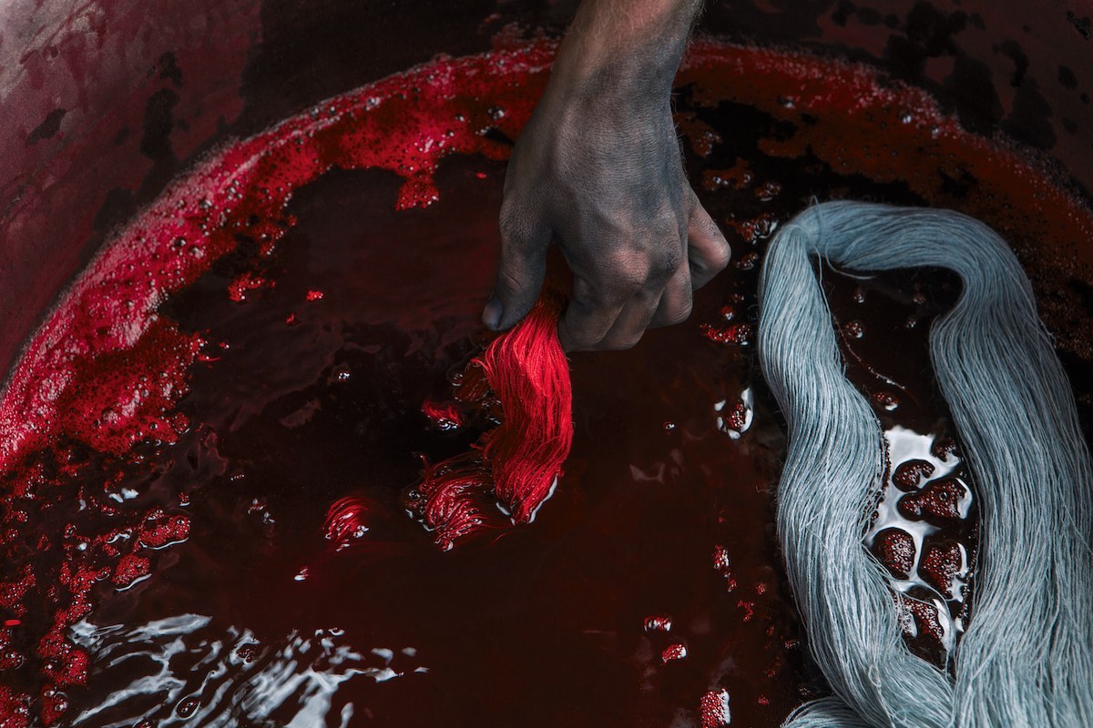
Somehow it has its roots in alchemy, it has to do with a scientific aspect of perception. And above all, it has no precise reference point, because it is based on “navigating by sight”. But it is also very much based on listening, it is a cultural mediation. It has its own discipline: it is not as wild as it might seem, but it has a very deep basis of research, of documentation. The fact that I always travel with huge suitcases says a lot about how I go about looking for things that can prepare the story.
Do you still work with fashion?
With Anniina (Koivu, design curator and Head of Master Theory at ECAL in Lausanne and founder of the knitwear brand Koivu, ed) we worked together on the colouring of her sweaters, in the past I had a two-year relationship with Camper. I am very selective about the companies I work with. But fashion still does not recycle anything, it is not able to offer an ecological alternative to consumption. The industry is very limited. Design also has to do with homes, with love, with things you pass on. I believe that the quality of a lamp, an object, an ornament can become a very beautiful story.
Is there any point in talking about colour trends in design?
I don’t believe in them at all. The real trend is not trying to invent one. Of course there is a kind of humus, the air we breathe – you just have to watch a film, go shopping, look at people in the street. I think all this stuff from specialised institutes is a lot of nonsense. I’ve never believed in fashion shows or the fashion press: I always preferred the more alternative publications. Or, I don’t know, the memoirs of St Augustine. You always have to go to other areas. On design: today we have everything, what more do we need? So something a bit gourmet, so to speak, conquers us. It is the gourmandise of colour that wins.
How would you define your working method?
It very much depends on what I am going to do, because I work in different areas: whether it is finding colours for a hospital (which I have done) or creating a suit for a sofa, my approach is always “made to measure”. After all, I was a tailor. I focus on the object I want to study, de-contextualise, re-contextualise. There is no real recipe, it is more a way of entering the scene. I studied stage design when I was young. I start by distancing myself, I like it, I look at the object I am working on from a panoramic distance and then I get closer. My work is everything and nothing, it is like a backstage companion before the performance.
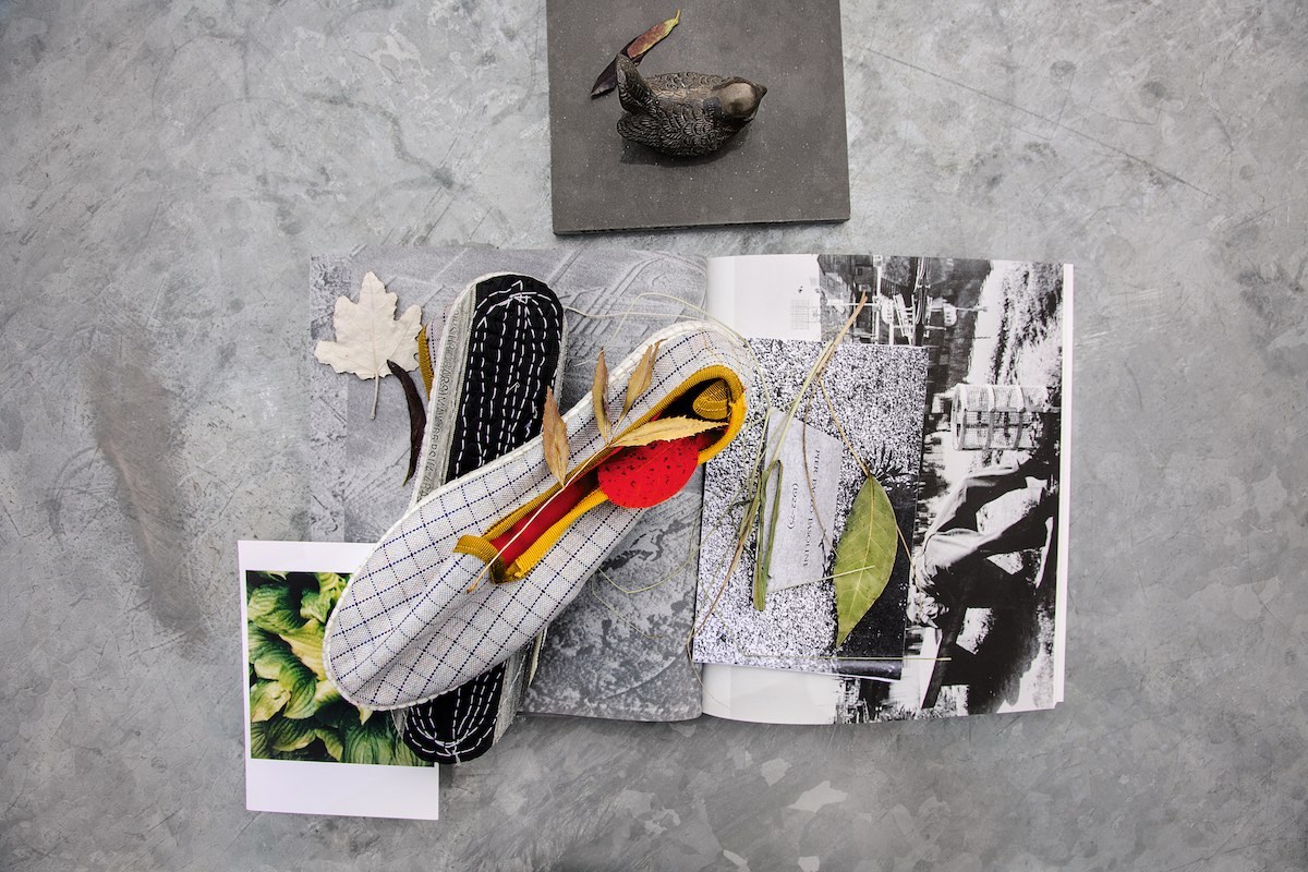
And what do you put on this stage?
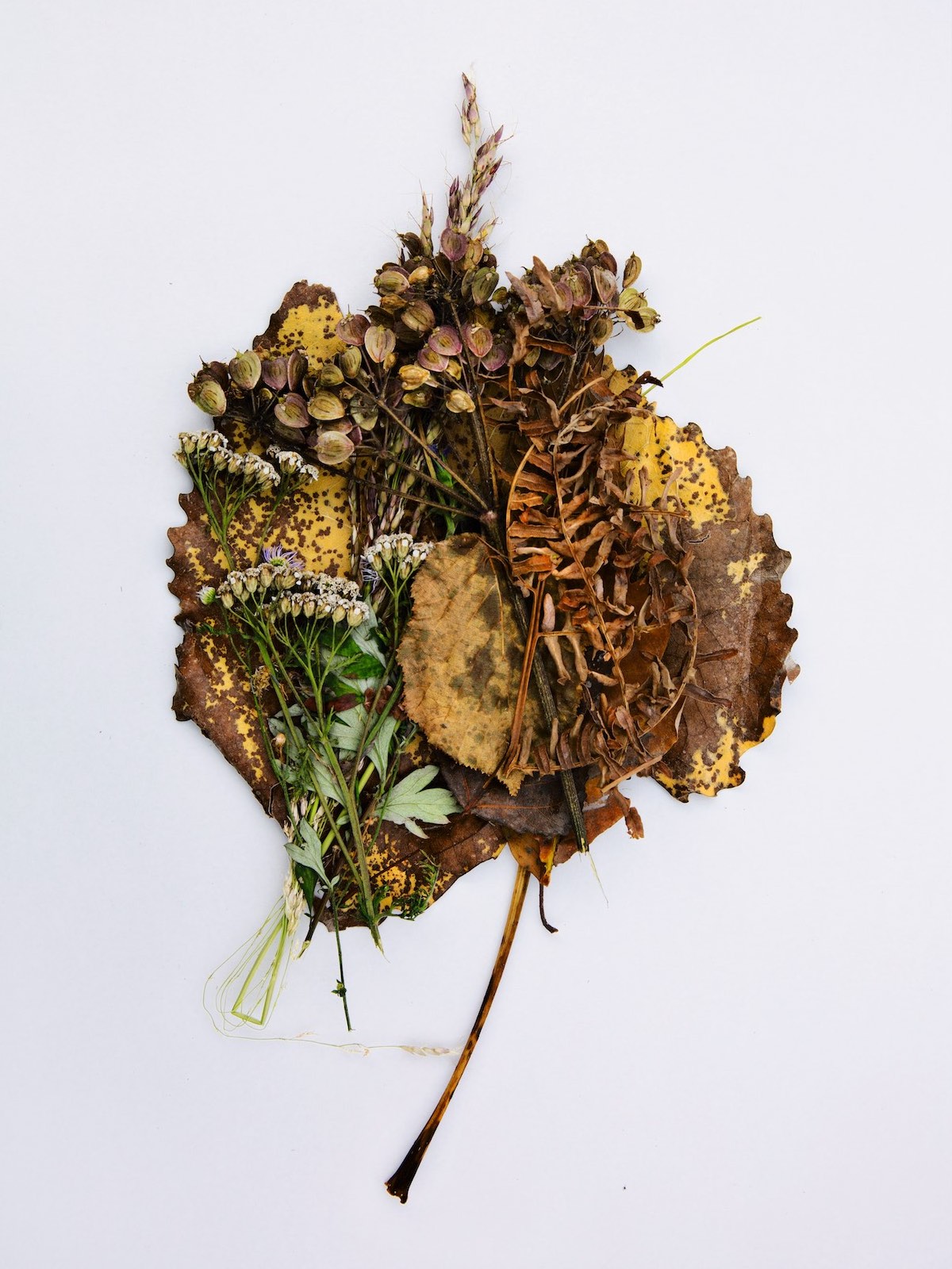
I collect fragments of vegetation, fabrics, materials. From there I create groups, which can be rural, metropolitan and so on. I look at them, I catalogue them, and then I work out who can fit into the story I am working on. It’s like choosing actors for a script. I put in things that make me curious, because I always want to feel a bit of awe. And I always think about the light that these objects, these spaces, will give off. But be careful: never be rigid, there must also be room for the unexpected.
How do you build a palette?
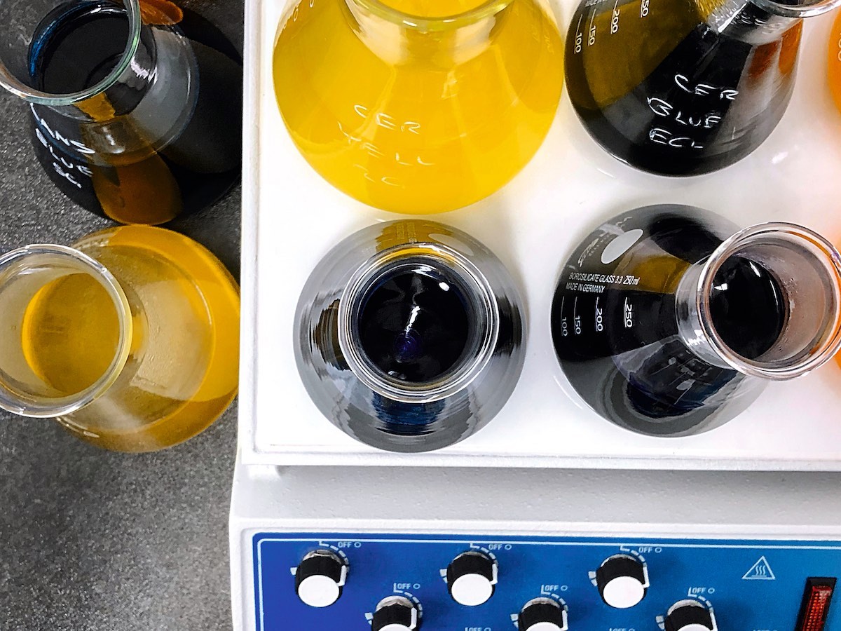
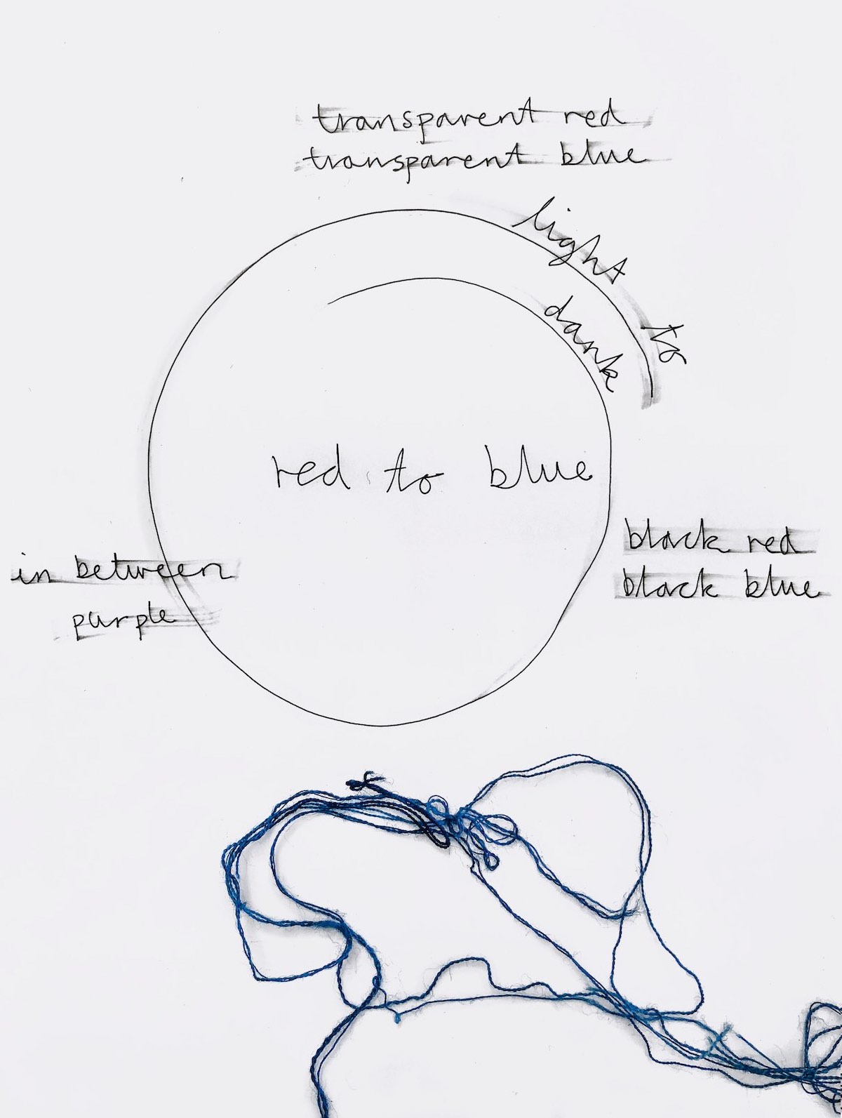
A ‘gamme de couleurs’ defines a slightly larger appearance. When I work with Kvadrat it is very complex: it is defined by comparison with the material, by analysing the vibrational quality of an object, its resonance in a space. Certain blacks are more suited to one type of fabric than another. And this is what defines a somewhat organic product, activated by contextualisation. Otherwise, the palette is a cosmic soup.
What are the colours of our time?
Certainly less bombastic than those shown in magazines, which always have saturated tones that are useless to me. I don’t think colour blocking is a solution to the black misery of the Covid years. In times like these you have to sharpen your mind, go for tones that are vibrations, iridescent colours, colours that make you see the shadow in the light. Colours that train you to see.
Plans for the future?
To volunteer in an ethno-botanical garden in San Miguel de Allende, Mexico (where I have a house), a place where we talk about the relationship of people with plant species: why they cultivate them, how they live in their biotope. It is a subject that I find very interesting, that speaks of the influence of botany in our lives, and that is not too far removed from the way I work. On the professional front, during Milano Design Week, Kvadrat will launch a new fabric: a project that has been going on for a year, a reinterpretation of a mat fabric, respecting its historical matrix but then developing it with modern, interesting yarns. With a bit of a ‘luxury car’ look. And then, once again with them, a moment of study that will also be a great pleasure for me: exploring the archives of Frans Dijkmeijer, a great Dutch textile designer – but I prefer to call him a weaver one of the creators of the ‘Kvadrat style’.
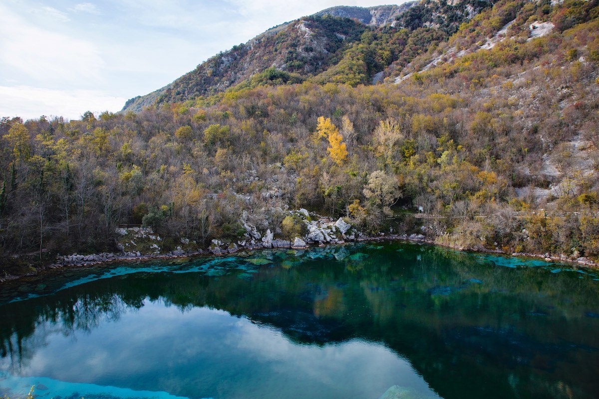
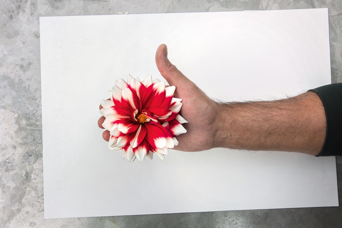
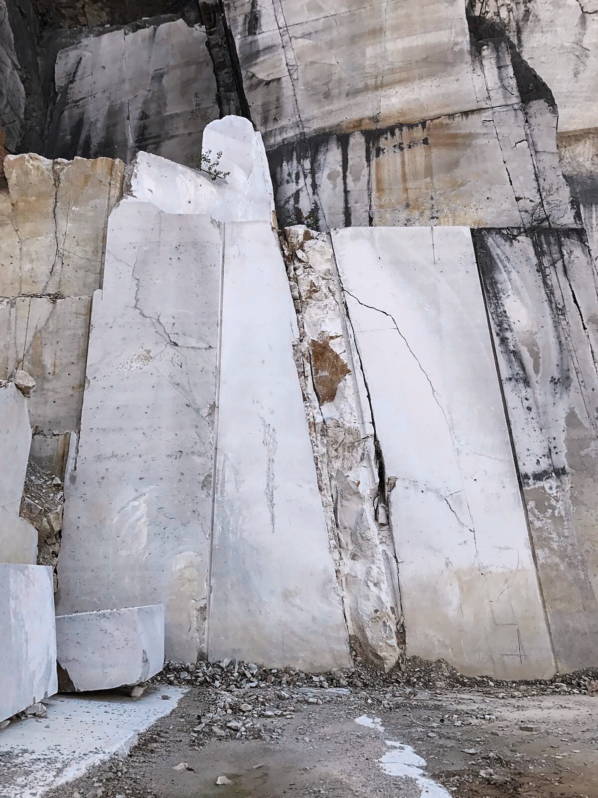
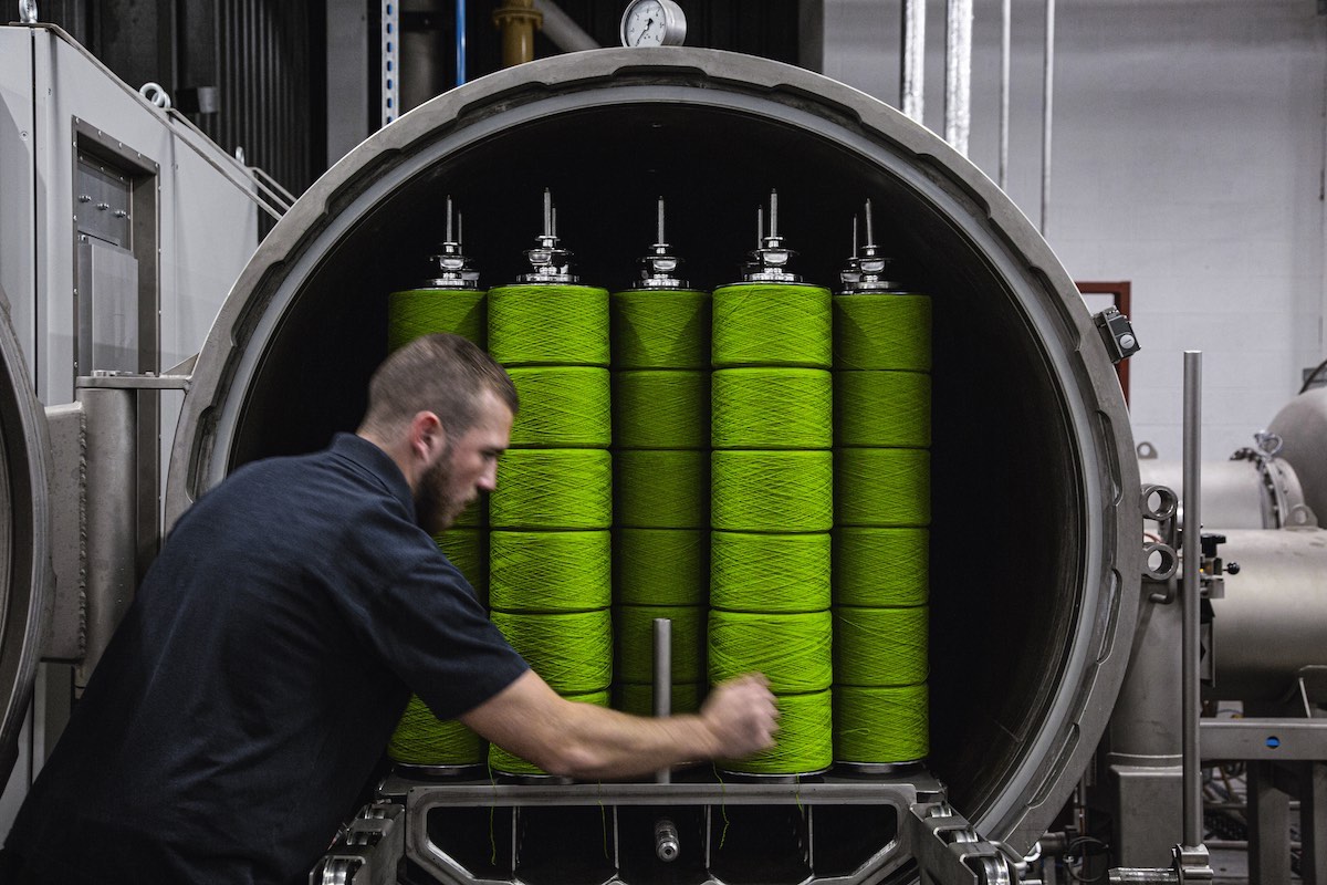
Unless otherwise stated, the images are taken from the book Materialising Colour: Journeys with Giulio Ridolfo, photographs by Howard Sooley (Phaidon).


