The global health emergency has shuffled the deck, to some extent, but the forecasts of ColorForward™ 2021 remain essentially the same, perhaps even more timely and pertinent than before. Each year, the international experts of the ColorWorks™ design & technology centers analyze social and color trends for the year to come; their color predictions result from intensive research and careful identification of innovations and changes in a wide range of sectors of society that influence the way consumers respond color. The correlation between these emerging trends (reduced to four macro-themes, or Stories) and precise chromatic palettes (five per Story, 20 in all), through an extraordinarily empirical procedure, lays the groundwork for ColorForward™ or the ‘color forecasting guide’: a narrative in ‘colors’ where each chapter offers a look at a different trend.
While for 2021 the experts of ColorWorks™ (who work in design centers located in Sao Paulo, Chicago, Merate and Singapore) initially focused on the central role of human beings, their relationships and emotions (aptly represented by generally warm, intense tones), to create a link connecting the four Stories, the events of 2020 are bearing out their intuitions.
Dumb numb and C-True – namely the first two Stories of ColorForward™ 2021, narrated in the spring-summer edition of this column – address, in one case, the extensive dependency on screens and digital devices that makes human relationships into a privileged action; in the other, the research examines the distrust of the society regarding information and brands, and hence a growing demand for authenticity and transparency.
In chromatic terms, the first has been translated into a bright pink, a discreet gold, an orange, a delicate powder hue and a gray; the second suggests a dark blue, a blanched orange, a fake gold yellow, a lime green and a brighter blue.
The voyage now continues in this second step, with the two conclusive Stories, Sense appeal and Ubuntu, where the themes of neuro-aesthetics and collaborative intelligence again put the accent on human beings and their relational universe – with respect to both things and persons. Themes that are more essential than ever today.
Our constant guide in this chromatic experience is Judith van Vliet, Senior Designer and team leader of ColorWorks™ EMEA.
Sense appeal
Every human action is connected to emotions. A factor big companies are trying to quantify and analyze through technology to get more connected with consumers. Researchers working in the discipline known as ‘neuro-aesthetics’ are attempting to identify the systems and mechanisms of our brain that respond to aesthetic input (color, design, visual art, architecture, music…), to find out how human beings react.
A research project by Orbis Research has shown that quantitative emotional computing (already valued at 16 billion dollars in 2017) is destined to grow to almost 90 billion by 2023; the market of wearable technology to permit identification of emotions (ocular monitoring, galvanic skin response, EKG, EEG) is going through a period of annual growth of about 40%.
Interesting preparatory projects are arriving from the big groups like Google, which in the installation “A Space for Being” presented in Milan last April investigated how aesthetics influences the human brain, analyzing emotional reactions to different interior settings (through sensors to track physical responses). IKEA, on the other hand, based on sensorial detection in customers, has experimented to learn their degree of interest in purchasing a product. Jaguar and Land Rover are investing in automotive wellness, studying the emotional state of the driver through his or her visual perceptions.
euro-aesthetics is therefore demonstrating how important it is to surround ourselves with things that make us ‘feel good,’ underscoring the value of good design capable of adapting to our preferences.
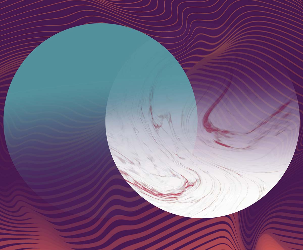
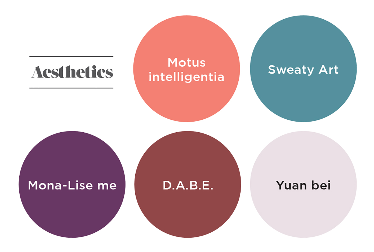
The palette of colors to identify this trend spreads through a soft coral pink, known as Motus intelligentia (the color of the emotional intelligence recognized by this new science that connects design and emotions) and the metallic green of Sweaty Art, representing emotional reactions to aesthetic stimuli. Then comes the intense violet of Mona-Lise me (mysterious as the painting of the same name), and the orangey shiny copper of D.A.B.E. – which stands for Design Augmented By Emotion – and winding up with Yuan bei, an apparently white hue that contains pigments of the D.A.B.E. tone, to represent the personalization that is increasingly in demand, to which neuro-aesthetics can help us to respond.
Ubuntu
A term has been borrowed for its efficacy from the Zulu language, as the title of this story: Ubuntu means “I am because we are” or “Humanity towards others.” This trend, in fact, puts the accent on collective cooperation. The interdependency of today’s society calls for new methods that rely on collective awareness to continue to evolve and to build new social systems. For instance? Swarm Intelligence, based on algorithms biologically driven by nature (the movement of groups of birds, bees, ants), replicated by robots to communicate and exchange information, thus applying a behavioral system like that of swarms. Blockchain itself becomes a means of being transparent, a vehicle of trust and cooperation, because it augments collaboration between companies, organizations and groups in the world.
The same dynamic has emerged in the project “My Roots in Africa” promoted by the startup MIPAD – the Most Influential People of African Descent – with the objective of planting 200 million trees by 2024 on the African continent through an initiative of social impact, contributing towards the healing of damage caused by deforestation; the partnership with Decagon Institute permits the use of data science and artificial intelligence to identify and geo-tag the trees, using blockchain technology.
When it comes to innovative cooperation, we cannot help but be reminded of the avant-garde project of the city of NEOM: presented as a new ‘smart city model,’ it will rise next year in Saudi Arabia, and also include territories of Egypt and Jordan; above all, it sets out to incorporate all advanced technologies to preventively respond to the necessities of future inhabitants.
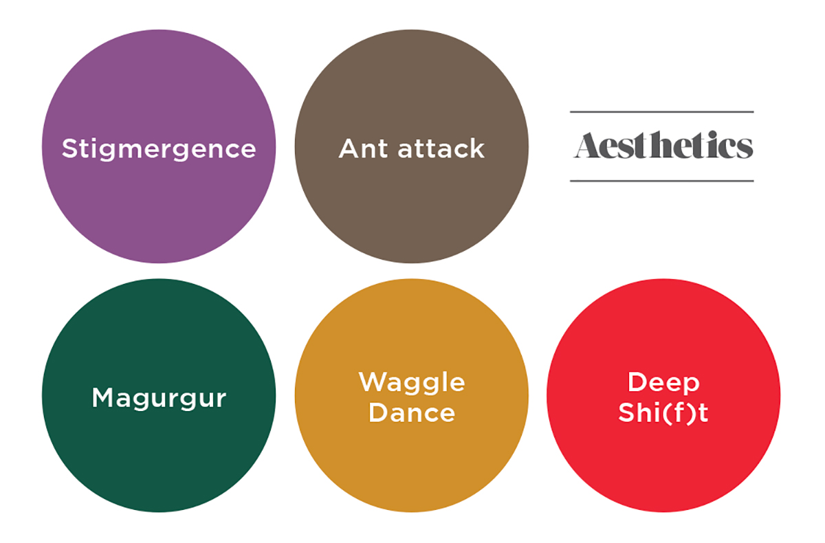
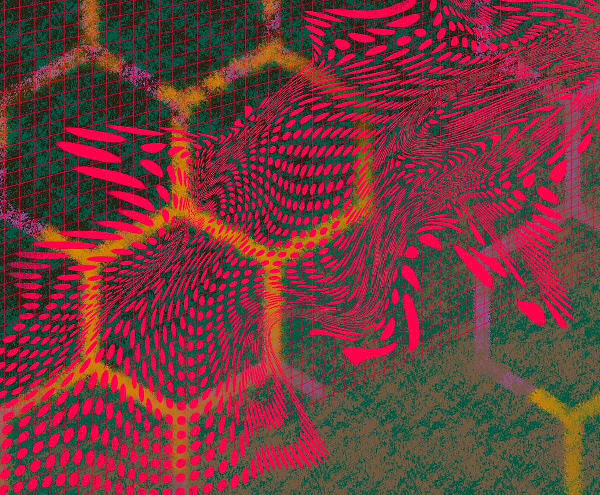
Dark, contrasting colors, suggesting the earth and Africa, emerge from this Story. With the name Stigmergence (derived from the term ‘stigmergy’ made up of the Greek ‘stigma,’ or sign, and the suffix ‘mergy,’ work or mechanism), this color with its dark metallic violet tone symbolizes collective minds that interact in a decentralized way for the good of the community. With Ant attack we can see a return to brown tones: with points of red having light metallic and translucent effects, this is a tribute to the organizational prowess of ants and their ability to adapt to different habitats.
Magurgur, which means ‘large boat’ in Sumerian, evokes the ancient epic of Gilgamesh and the universal deluge; the dark green (with a pinch of yellow) suggests nature and the idea of safeguarding the human race and the world’s species. There has to be an amber tone, the color of honey and beehives, a direct reference to bees: this is Waggle Dance. Finally, the bright red of Deep Shi(f)t, concealing tiny internal glitter: the tone of alarm indicates the complexity of today’s problems, also the hidden ones, which we experience every day.

