As usual, in this moment of the year one of the most influential institutions in the field of colors has issued its indication of the hue for 2024: a peachy pink. But what if we were looking for something a bit more vibrant and bold?
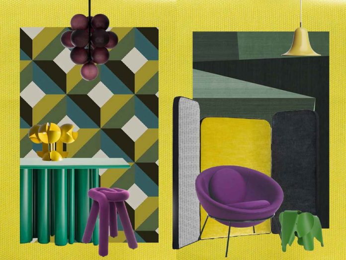
To stick with fruit, our response involves two shades of kiwi. More acidic than pink, and therefore more effervescent. To match and balance with a violet/plum hue. A perfect mixture that goes beyond the “rosiest” expectations of the other fruit. We have deployed them as follows: a bit of warm, sunny yellow, various greens – more or less sharp, depending on the situation – widely scattered in the background. With contrasting accents.
The protagonists we have chosen are historic pieces and contemporary creations, all standing out for a geometric but never too serious look. In fact, these shades are light and playful, though functionality is still a must. Demonstrating that design can be one of the forms of happiness.
Gold Quality: for our backdrop, a moiré from the Amoir Libre collection by Dedar adds a touch of light to the tableau.
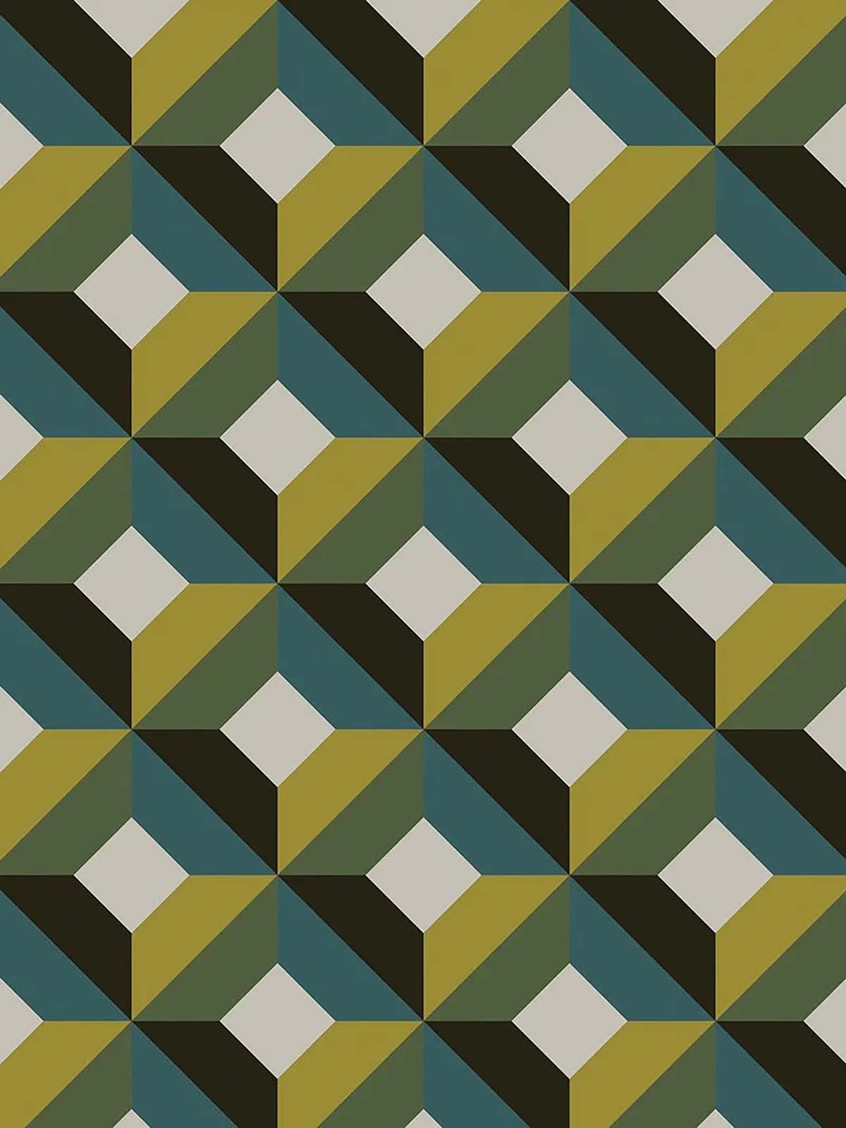
A geometric texture to express a sense of precise, harmonious beauty through regular and symmetrical forms, the Tallinn wallpaper by Jupiter 10 brings a hint of black that puts all the other tones together.
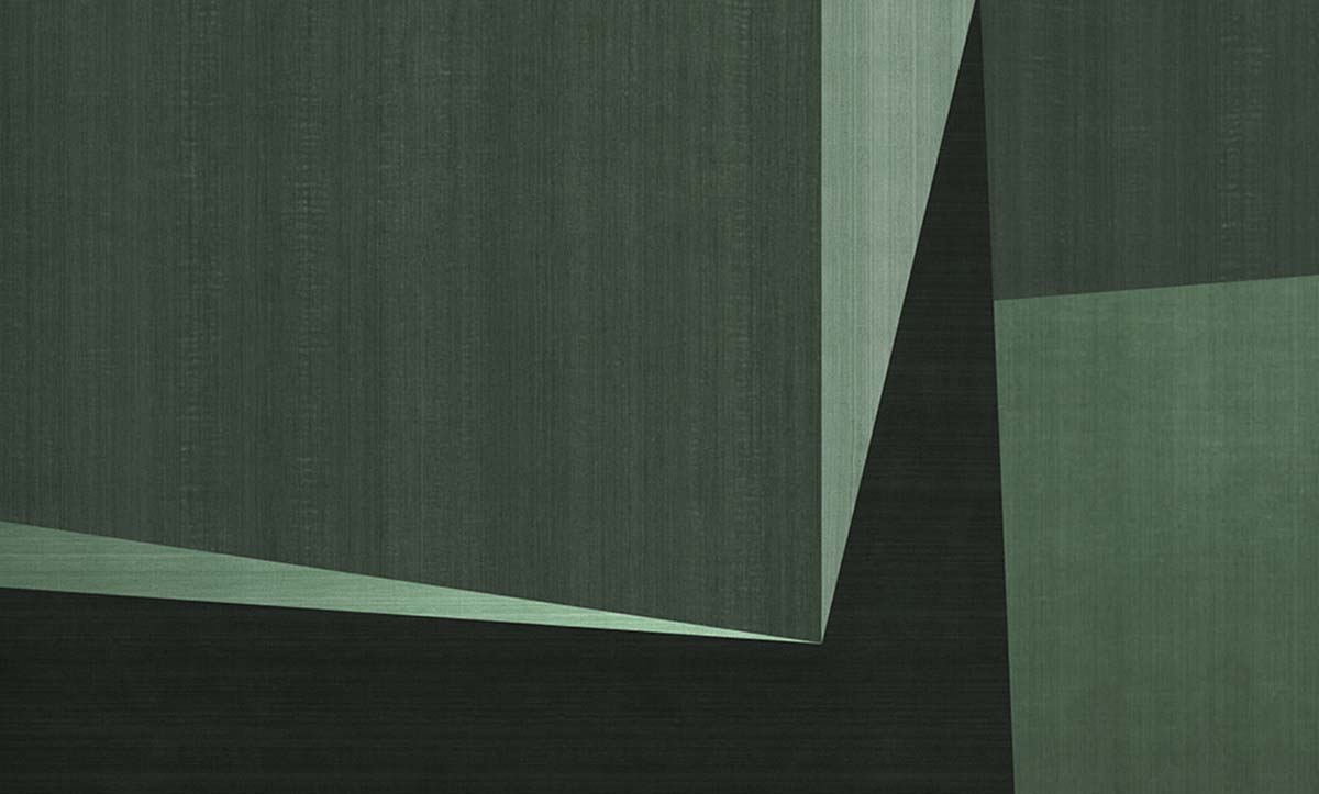
Light shadows, shadings to add depth: the Anyway wallpaper created by Pietro Gaeta for N.O.W. Edizioni bestows breadth on the composition.
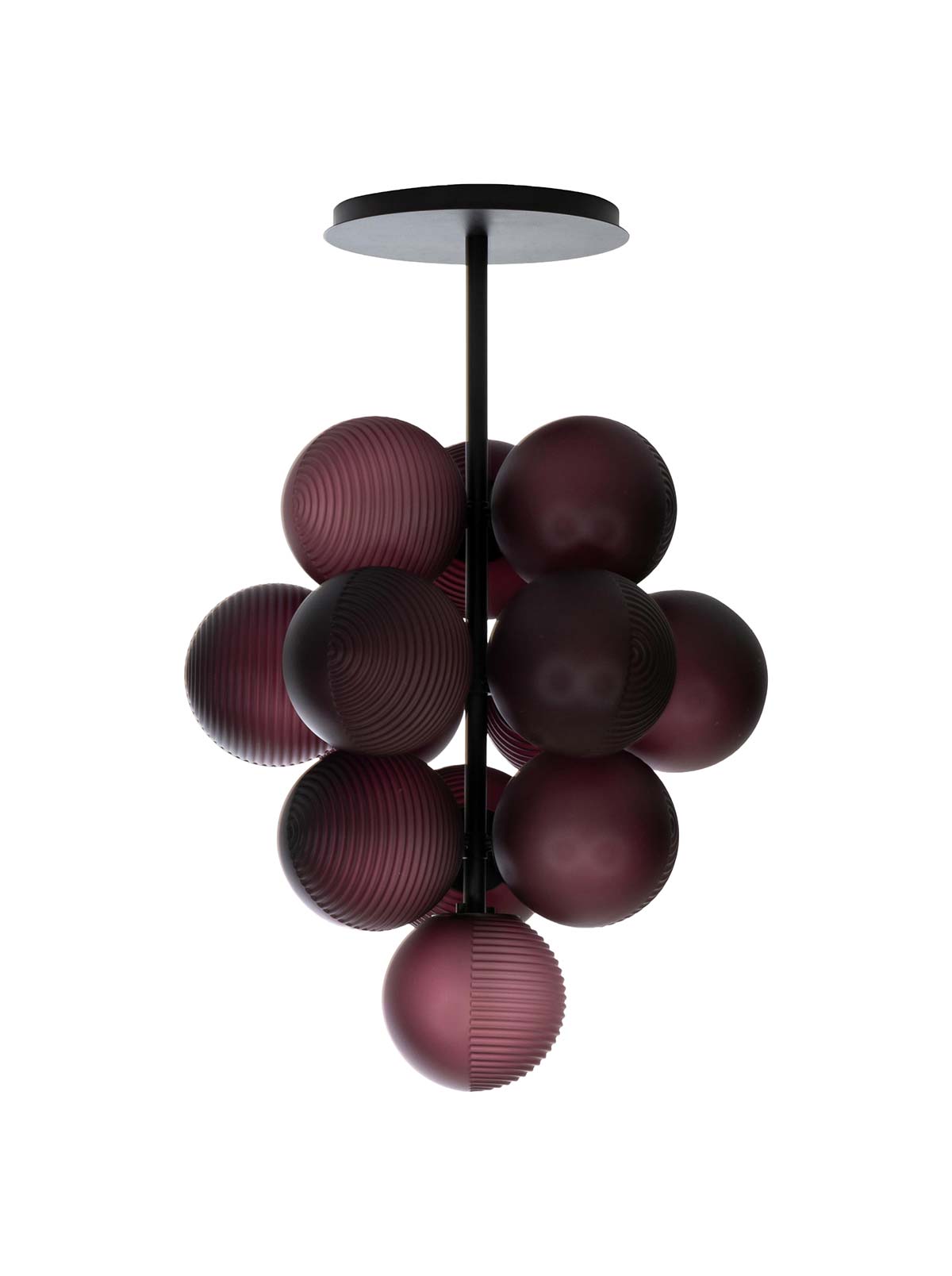
Speaking of fruit: Stellar Grape is a series of lamps created by the designer Sebastian Herkner and produced by Pulpo, where the diffuser globes in handcrafted blown glass seem like clustered grapes.
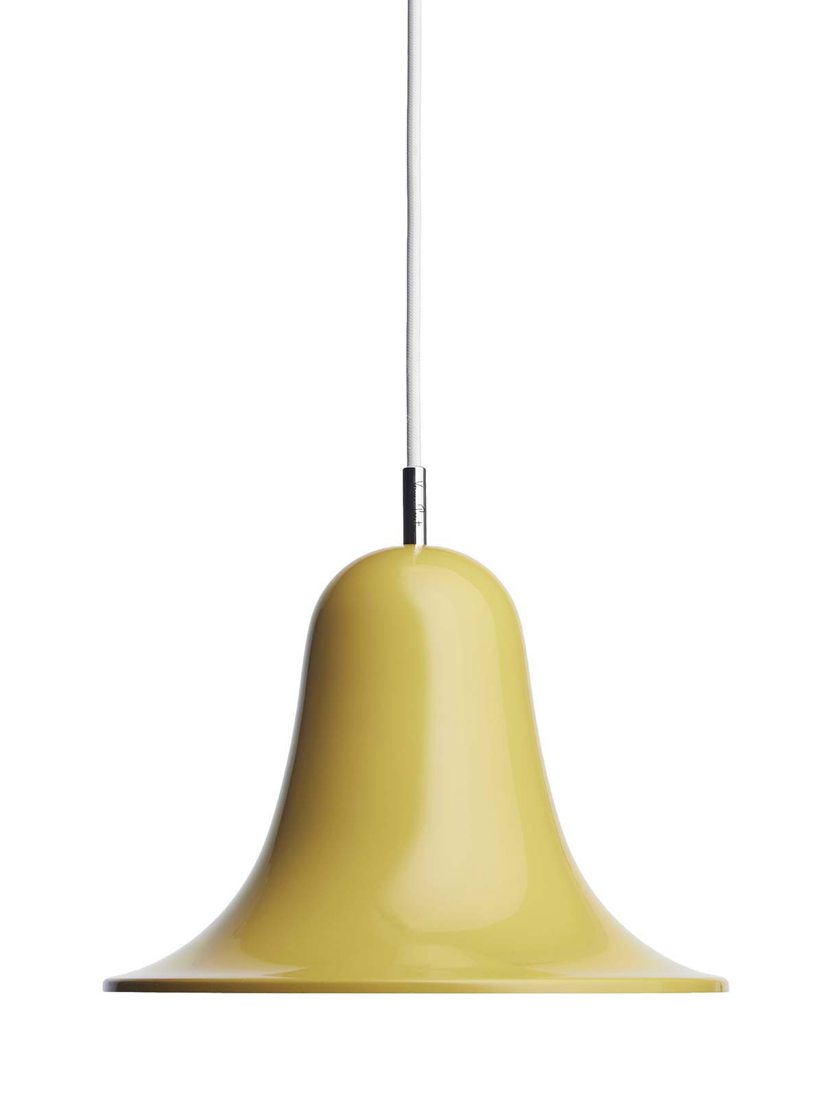
For lighting, a delicate reference to the countryside, thanks to Pantop by Verpan, designed by Verner Panton in 1980, with its bell-shaped flared shade opening downward.
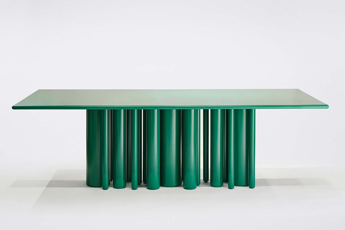
The Townhouse Green table made for SoShiro by Interni Design Studio stands out as a sculptural focal point for any dining room, including brightly colored settings like ours.
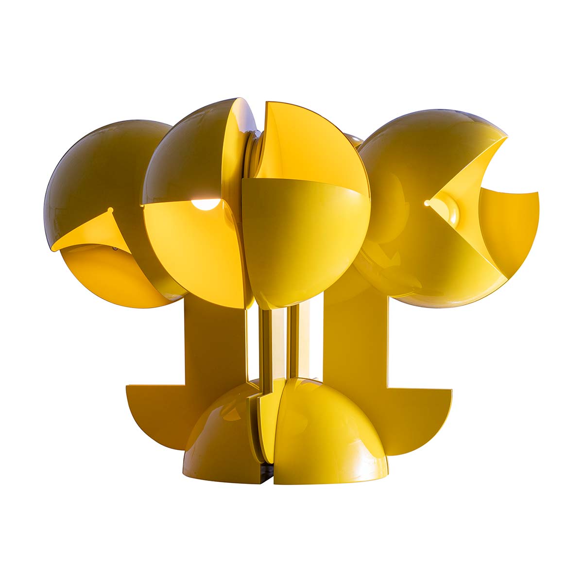
Produced in yellow coated aluminium, the Ruspa lamp by Gae Aulenti for Martinelli Luce (seen here in the version with four arms joined to the base) is the erudite pop presence that couldn’t be missing.
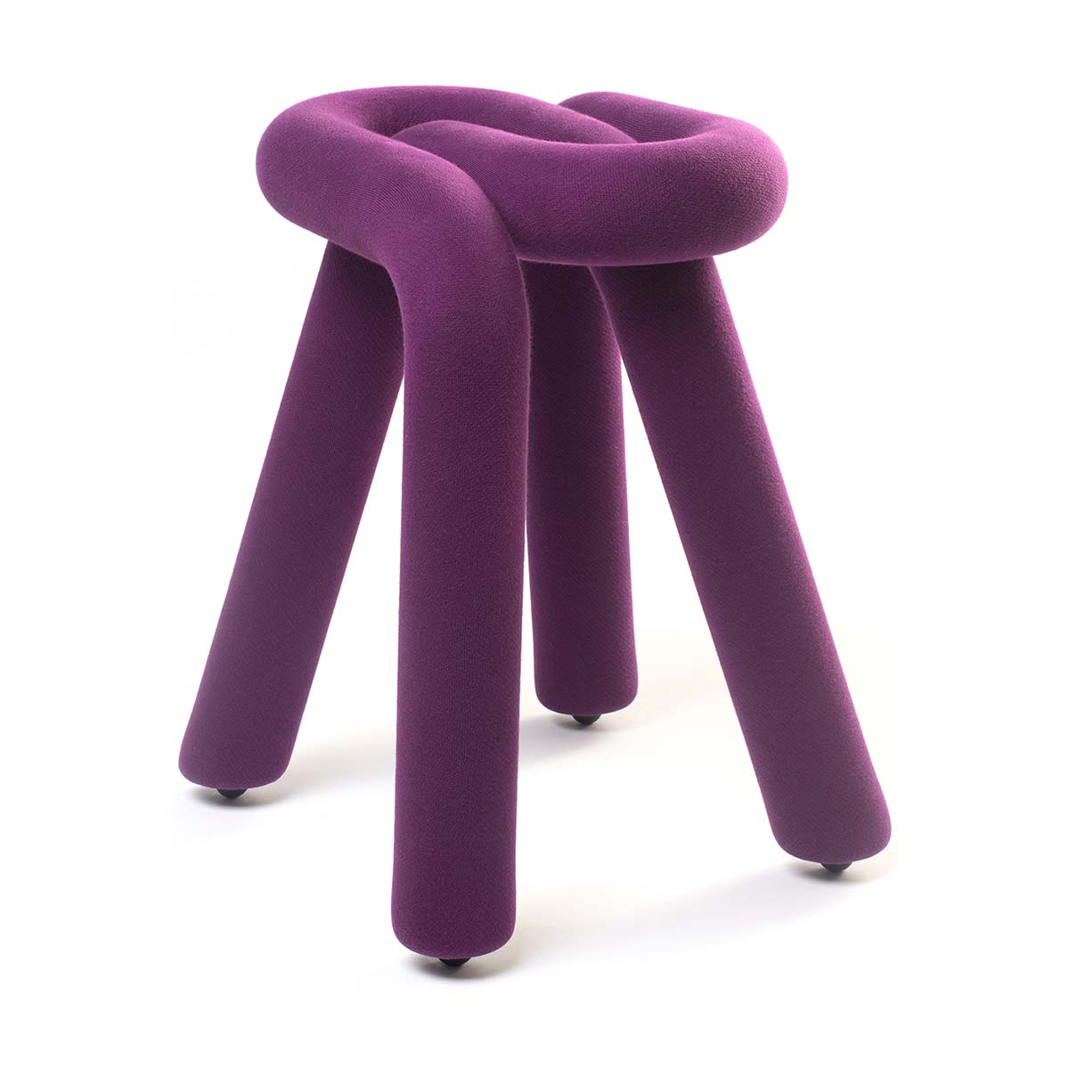
Irony and function: the Bold stool from Moustache, designed by Big Game, softly revisits the tradition of furniture in steel tubing, where the structure and the padding become a single whole.
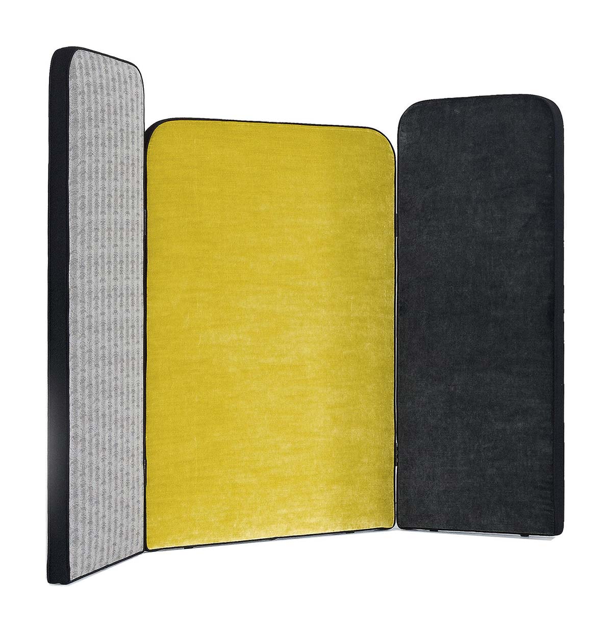
To add dynamism to a static, immutable wall, a screen can always trigger new perspectives. Diva by Arflex coordinates a complex setting, with three fabric covered panels.
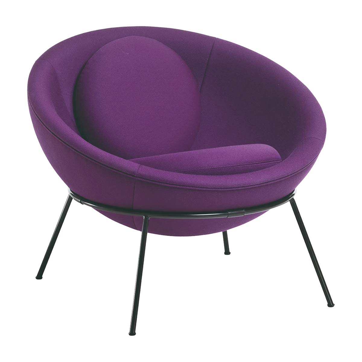
A “bowl” becomes even more welcoming thanks to the presence of two soft circular cushions. It’s the Bowl chair by Lina Bo Bardi, produced by Arper, where the padded seat is astutely left free of the structure to provide freedom of movement.
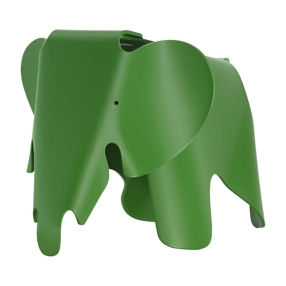
The elephant designed in 1945 by Charles & Ray Eames (now produced by Vitra with the name Eames Elephant) was initially made in plywood. Today it is available in plastic with a range of colors, including a dense, botanical green.

