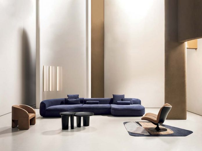
Over the short term it was impossible to physically transport the Baxter community to Milan for the presentation of the new developments for 2020, due to the shutdown triggered by the pandemic. However, “since they cannot come to us, why not go to them in another way?” The idea of the CEO Paolo Bestetti quickly took form, grasping the unexplored potential of the moment. The main challenge was to make the new collection understandable at a distance, without altering the essence of the company made up not only of excellent design, but also and above all of emotions and sensory experience
Technology has undoubtedly made an enormous contribution, compensating for the need for physical contact previously seen as indispensable. But this tool has been utilized in a very refined way. With one digital step, partners and fans of the brand all over the world got involved in the WorldWide 2020 project, an almost simultaneous voyage (during the same day, but on different schedules) to discover the new proposals, entering the new virtual home of Baxter. Above all, without losing time, starting in May a launch was carried out inside the international retail network (over 70 countries) that permitted points of sale to already be prepared, in October, for the choice of products to present in showrooms. “Baxter has always conducted research on colors and materials, and this is a very hard aspect to convey at a distance,” Bestetti says. “You feel material, and it transmits emotions. So we have physically shifted our research to the clients, and what was fascinating was their reaction when they had a top-secret preview of new products, with a mixture of digital and sensorial clues, touching the new leathers and the new materials.”
This year the chromatic study has concentrated on 3 palettes juxtaposed with different materials: the first is classic, reassuring, where warm chocolate tones are combined with strong blueberry and camel tones, matched with brass and white marble, like the Bianco Gioia variety. The second contains various shades of green (from military to bright lime), accompanied by gray tones; the associated metal is nickel silver. The third is surprising, featuring a very bright turquoise combined with a ‘nude’ color, a sort of flesh tone.
The designers, together with the in-house styling division, have worked on sensorial forms and comfort, to establish a mood. They have been involved in a video for firsthand accounts of projects, face to face with their creations, from inventors to users as they try out and sample empathic characteristics.
The soft, reassuring roundness of the Milano sofa by Paola Navone, the playful sensuality of the Leon armchair, the primitive print of the Greta chair by the duo Draga & Aurel, and their Googie wall lamp: everything connects design and memory.
Not to mention the strong material impact triggered by Studiopepe with fused glass and marble, in the Verre Particulier tables or the Azzal bookcase, inspired by the footprint of the Pirelli tower by Gio Ponti; and the rounded corners of Stone, a bed whose modular headboard is a reminder of stones shaped by water. The large Tunnel lamps in plexiglass spread light, generating a delicate effect, both by Federico Peri. Finally, the ‘viewpoints’ of Pietro Russo, with the Peris mirror, like a dihedral angle for a vision beyond what is reflected, and the Parsec desk based on study of how to cut a form and obtain infinite forms.


