Space for yellows and oranges. But also midnight blue and intense shades of violet. The palette for the year to come is an engaging rainbow of warm, deep hues. A far cry from the tones that dominate in 2020, where there has been more space for cool, forceful tones, representing a society in conflict, in pursuit of balance, with respect to itself and to the innovations and technologies that are shaping its future.
There is a close connection between the emerging movements of society and the colors that set chromatic trends: the research and interpretations have been carried out by ColorWorks®, the design & technology division of the business unit Masterbatches of Clariant, and its international experts at four centers (Sao Paulo, Chicago, Merate and Singapore).
Global trends – deduced by identifying innovations and changes that emerge from society and its dynamics in a wide range of sectors – have been grouped in 4 macro-themes, or Stories, literally translated into 20 colors (5 per story) to reflect the spirit of each theme. Since 16 years the research has led to ColorForward®, namely a ‘color forecasting guide’ that contains and announces color trends for the coming year.
The central role of human behavior, relationships between individuals, their attitudes and emotions – as seen in the research of ColorWorks® – creates a red thread through the global trends for next year: hence the general prevalence of warm tones.
Dumb numb narrates the increasingly overriding dependency on screens and digital devices, which makes human relations a matter of privilege; C-True embodies the distrust of society towards information and brands, and at the same time the growing demand for authenticity and transparency; Sense appeal is the story on neuroaesthetics, the revolutionary translation of human being individual preferences to aesthetics. Finally, Ubuntu – a term that in the Zulu language means “I am because we are,” is a story that focuses on collaborative intelligence and collective awareness.
But the (conceptual) shadings of these stories are much wider in range, as are their origins and their respective chromatic results. An introduction to this unexpected, surprising world is offered by Judith van Vliet, ColorWorks® Senior Designer and leader of the ColorForward® team, in an exclusive interview divided in the two annual Projects&Hospitality publications, to reveal the Color Trends for 2021.

First Story: Dumb numb
Over two thirds of the world population has a device; 91% never leave home without it, and 46% say they couldn’t live without it. It’s a fact: we have become ‘screen slaves’! Devices are always with us, to capture every moment, every experience or event. From museums to concerts, smartphones are an increasing invasion, forcing many venues to prohibit their use during events. Ironically, according to science, when we document those events we tend to remember them less! Research has shown that the use is strongest among the young: teenagers spend 8.7 hours a day looking at screens just for entertainment, while 60% of them also use them for everyday educational activities, though for tweens this quota is 27% (just 4 years ago the numbers were respectively 29% and 11%).
But exposure to screens starts even earlier nowadays, with very high risks from a cognitive standpoint: according to the National Institute of Health, toddlers who spend two hours a day in front of a screen have reduced abilities of thought and language, and over seven hours a day they may suffer from a premature thinning of the cerebral cortex. In adults, there is a correlation between screen time and depression. Even the mere physical presence of a smartphone seems to generate a remarkable drop in attention.
Paradoxically, these first alarm signals arrive precisely from Silicon Valley, where the tech giants shape the future of the industry, where the most affluent families prevent children from having access to screens, even stating this in contracts made with babysitters. While until a few years ago there was the common thought that having access to technology was a privilege, offering greater availability of information and hence greater expectations (in work and education), today we are seeing a completely reversed digital gap: higher rates of screen time happens in low-income families as opposed to the wealthy ones, which instead try to avoid technology in our increasingly connected lives. This results in human engagement to have become a luxury (a concept summed up in the expression ‘luxurification of human engagement’), along with the most authentic luxury, far from hyperconnectivity, in contact with nature, off-grid, so to speak; experiences that become a new, sought-after status symbol.
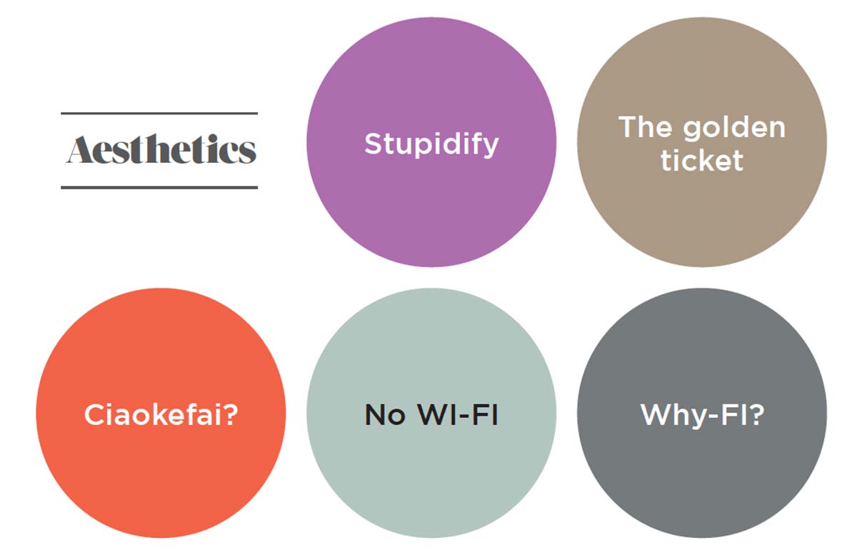
The colors of this Story are all connected with key concepts. Starting with Stupidify, a term that refers to the negative consequences of too much screen time: a bright pink, a metaphor of simplicity and superficiality. The golden ticket references the tones of gold, discreet and sophisticated, like the elite that can afford to have human contact and off grid luxury experiences. Warm, strong, the orange named Ciaokefai? (Hey Whassup?), a title based on Italian youth slang, symbolically suggests friendship and human contact. No WI-FI: like the name says, this soft delicate green shifts away from the coldness of the screen and points to the most authentic experiences, far from technology and its radiation, which instead determines the gray of Why-FI?, a color and at the same time a question mark: do we really need to always be connected?


Second Story: C-True
We live in the era of authenticity, society demands for transparency and truth, both in people and in what surrounds us. We look for authenticity in our leaders and the celebrities we follow on the social networks, in the products we purchase and the brands that produce them.
It is no coincidence that the influence of Instagram is diminishing: the engagement rate for sponsored posts by influencers was equal to 4% three years ago; in 2019 that figure dropped to 2.4%. A decrease of 50% connected with the growing distrust of users with respect to artificial profiles and advertising. A trend that has convinced multinationals like Unilever and Kellogg’s to eliminate influencers from their marketing campaigns.
The latest research published by McKinsey on consumer behavior shows that 70% of all the demographics analyzed prefer to buy products from companies they consider ethical, while 80% among the generation X would never buy anything from brands involved in scandals. But how can we understand if a brand is truly trustworthy? Often the borderline between woke-washing and authenticity is blurry and hard to interpret: as in the case of Coca-Cola last summer, when they launched a campaign of awareness of recycling in The Netherlands and Belgium with the slogan “Don’t buy Coca-Cola if you’re not going to help us recycle.” Or Heineken Mexico, which last year – for the local brand Tecate – produced a campaign in favor of women, with the dictum “If you don’t respect women, we don’t want you to drink us”, resulting however in a rise of requests of help to the national shelter network and 75% more income for this network.
The best way for consumers to take away their doubts about ethical authenticity of a brand is to rely on technologies such as Blockchain that reveal full transparency across all points of production including supply chain. IBM, in this regard, has created the TrustChain, the first collaboration in the global jewelry industry that uses blockchain technology to trace the sourcing of diamonds.
The distrust also extends to the big players and what they channel in the area of data and information – controlled for years by giants like Google, Facebook, Amazon (just consider the deepfake phenomenon and then the systems to combat fake news created in recent times): this has led to the Dweb, or decentralized web, which uses links that point to real content and not to its position on a single server; the data can thus reside in multiple locations, eliminating unilateral control, establishing peer-to-peer continuity to create micro-communities, boosting data integrity.
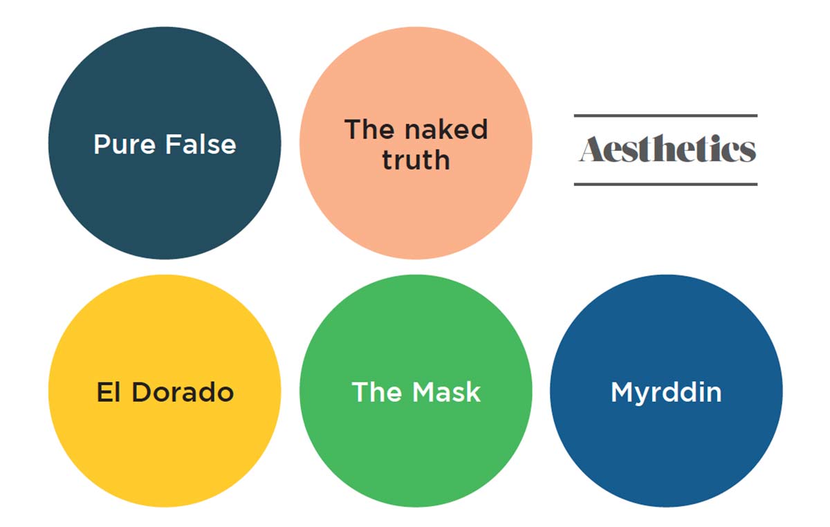
Colors get darker and more serious (as required by the theme of true, authentic products and services), while the touches of light rely on tones that suggest the light at the end of the tunnel. Pure False evokes the hues of marble, deep and dark, a mixture of dark greenish blue, white, black and gray, referencing the market of fake products that continues to grow. The naked truth is the color of the Financial Times (a classic faded orange), considered one of the few newspapers that has kept faith with its mission. El Dorado, with its name that ties back to the mythical city and its golden nuances, cautions us against the fact that “all that glitters is not gold.” Translucent, artificial referencing green washing, the lime green of The Mask not only references the film of the same name, but also and above all the masks behind which brands hide their true intent. Myrddin has fully positive attribute, taking its name from the prophet of the Welsh legend who went mad in the face of falsehood; hence a blue (like his tunic) is added to the palette, a hue that in color psychology implies trust, loyalty and intelligence.


