
It renews the appointment with colour.
The start of this extraordinary collection dedicated to design is entrusted to the book Color Stories, exclusive and original content produced in collaboration with ColorWorks®, a business unit of Clariant, in a weekly edition that will accompany every IFDM publication in order to preview the Color Trends of the following year.
Colors and the trends connected to them – a very important aspect of the product process and interior design – were the topic of discussion with Judith van Vliet, ColorWorks® Design and leader of the ColorForward® team, that is, the ‘color forecasting guide’ that identifies the 20 trendiest colors, the outcome of the 5-day workshop that every year involves the four ColorWorks® centres in the world (San Paolo, Merate, Chicago, Singapore) and their key people.
What is the basis for these colors? How are they chosen and why are they “trendy”?
The answer lies in the very concept of the term ‘trend’, understood as orientation, inclination, direction of a phenomenon that involves the whole of society. In fact, the Color Trends are determined by those changes and emerging movements that, at the global level, the experts of ColorWorks® perceive and identify in the early stages, then grouped into four macro-themes (or ‘Stories’ as they are called) each one of which “translates” into a palette of 5 colors, 20 in all, that define the ColorForward® for the following year.
The first two of the four Stories representing the 2019 trends were revealed in the Spring | Summer edition of the Book. These Stories hinted at an increase in positivity worldwide, reflected in a broadening use of colour, as against the general disorientation felt by the international community in 2018, reflected in the use of unsaturated, “dirtier”, neutral hues.
Entitled CTRL+F, the first topic highlighted the need to regain control and counteract the growing interference of technology in our personal and professional lives. This explains the onset of bold hues such as smoky black, fluorescent orange, champagne, glittery silver, and blue with tinges of violet. The second, complementary topic, entitled Made in Human, put the spotlight on the purely “human” qualities of social evolution, marked by creativity and critical thinking. This is represented by brighter colours, such as soft yellow, aqua green, canvas beige, cherry red, and dark purple with traces of red and white.
And now for the last two Stories.
Third story: Do Not Disturb
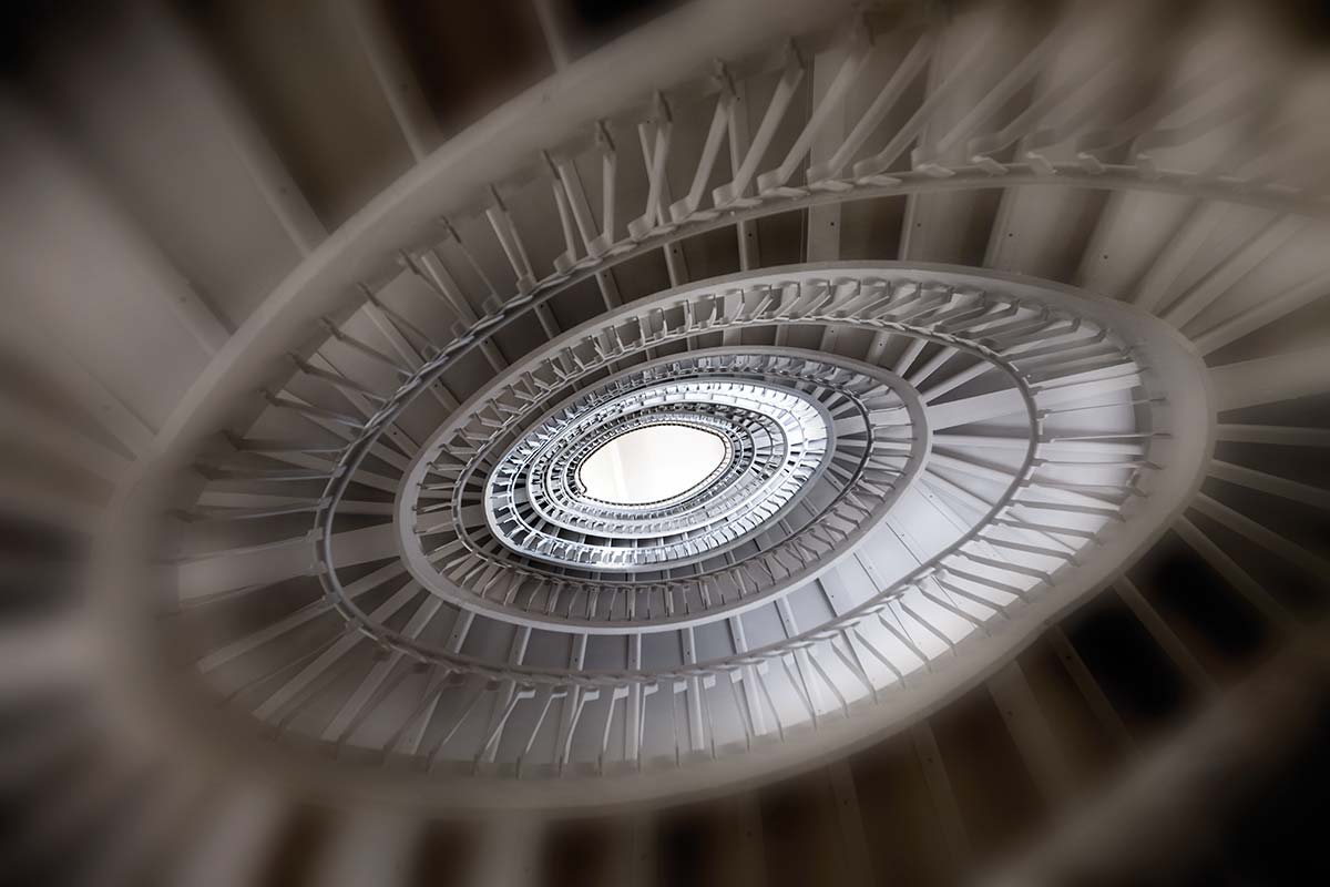
We are unproductive. The more technology extends its reach into our everyday round – paradoxically in order to make it easier – the more we lose concentration and the ability to focus. This is the dilemma of today’s global culture: society, in a constant ‘on’ state, is besieged by distractions (mobile phones, computers and every high-tech tool that features in our daily lives) that undermine productivity. According to the University of California, we keep only 11 working minutes a day free of any distraction; productivity falls by 15% in open offices and, in parallel, personal wellbeing is reduced by 30%. Companies are acting directly to come up with solutions. Navy Design has introduced “quiet time” in its office, an hour dedicated to silence with any device placed in ‘offline’ mode, and has attained impressive results: in a couple of months, productivity rose by 23% with visible benefits for the mood and wellbeing at work. Other companies have introduce “Cave days”, days dedicated to the closure of a current project, when a person called a “anti-procrastination nanny” works alongside the personnel to aid concentration and help them attain the objective.
If the distractions become excessive, the possibility of the choice to which we potentially have access is also correlated. We live in an era that the Americans call “Stuffocation”, to which society responds with an attitude of “anti-choice architecture”: people are more willing (according to a study by Siegel+Gale) to spend more in order to have a more unique experience.
It follows that the color palette combined with this trend also favours sober, restrained, subtle hues that – unlike strong colors – aid concentration.
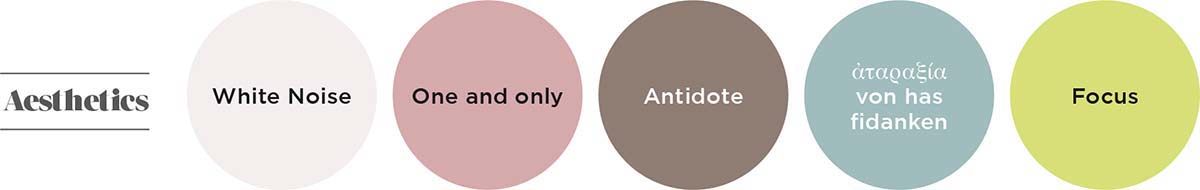
Like White Noise, a white featuring a grey point; or ἀταραξία (atarassia) von has fidanken, a dirty green/blue, which refers to the concept of atarassia, an emotional state of complete tranquillity. There is also taupe, a color that is coming back into fashion, proposed in Antidote with a hot red tip; One and only is a soft mauve, representing anti-choice architecture. And finally, Focus, a keyword in the Story, a natural but more vibrant green to indicate the climate of positivity that 2019 evokes.
Fourth Story: Umswenko
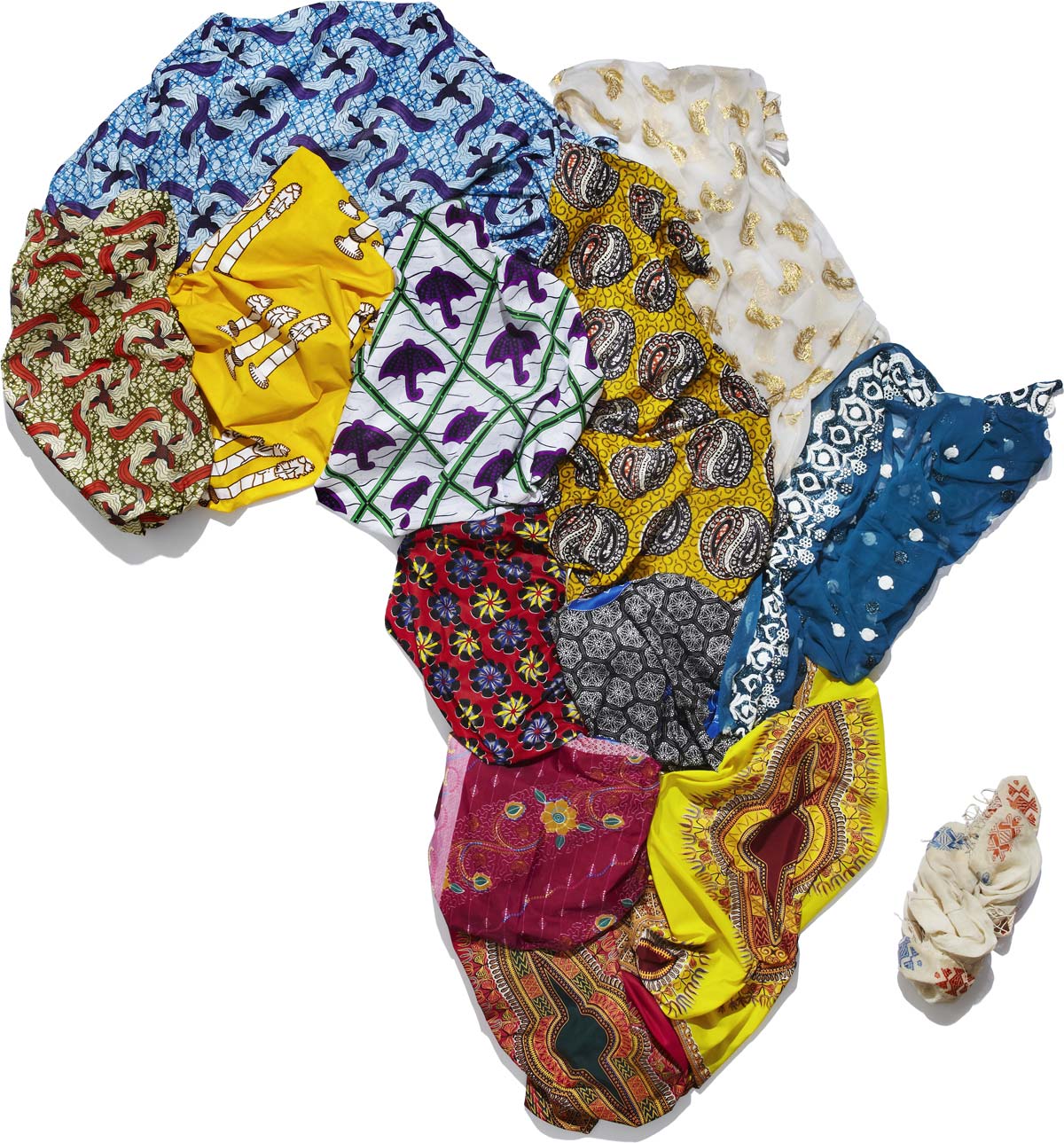
A searchlight pointed to the African continent and its very rich cultural heritage, now finally appreciated and brought over the borders by the new generations. The merit belongs to the Afrillennials, or African millennials who, for the first time in history, have seized the history and heritage of their country in their own hands to take it in a new direction. Even though is it the continent with the most extreme poverty, it is also the place that the greatest growth is being attained after the Asia Pacific region, benefitting from the largest population of young people in the world. They are the promoters of change and a new expressiveness that is manifest in the forms of fashion, photography and art, while remaining in close contact with their original culture, which they seek to present in its most truthful heterogeneity. In music, for example, through AfroBeat, which has become the music of urban millennials in Africa; or in the fashion sector, where European and American trends meet the underground subcultures and generate original results. The contagion has also spread to the most avant-garde sectors. For the first time, from 2015 onwards, foreign investments on the continent in oil and minerals have been exceeded by investments in financial services, telecommunication and consumer goods: Nollywood is growing apace (Nigeria’s Hollywood), a movie industry worth 600 million dollars with 2,500 films a year, and Silicon Savannah (the equivalent of Silicon Valley) has been developed by Nigeria and Kenya; the Andela social enterprise, financed by the Chan Zuckerberg Initiative, was founded here to introduce and support the younger generations in the tech field.
So which colors interpret this creative euphoria?

Primarily Afar, a burned, powdery orange (Afar in Phoenician means powder), which recalls the color of the African earth. The intense yellow of Fonio is a tribute to the super cereal that – known and used for millennia on the continent – is finding new popularity in modern, more avant-garde cuisine thanks to its numerous nutritional qualities. The sound of Africa lives again in Tribeat, a vibrant orange with ‘juicy’ tones. Equally fresh and clean is the green of La Sape, a color linked to the new Congolese subculture of the African Dandies who mix European fashion with local textures. Finally, Kwemizi, a term that means ‘fireside’ and recalls the importance of storytelling expressed by the new generations through art and images that currently takes the name of Afrofictionism. It is a black color with lighter veining, recalling the color of the cinders in the fireplace, that offers a more organic sensation of the finish.


