
Oranges and greens alongside dark blues and natural tonalities. The common thread for colors set to paint 2018 is widespread sobriety, a lower-key tone compared to the brilliant and vivacious nuances which have defined the current year. Colors are “dirtier”, less saturated, contaminated by a touch of black, transposing a sense of bewilderment. Color Trends of the upcoming year reflect a profound change in contemporary society and convey uncertainty, the search for new experiences and approaches, in a well-defined color palette, showcasing dark neutrality. According to research carried out by ColorWorks® (a branch of Clariant) and its four Centres (Sao Paolo, Chicago, Merate and Singapore), which annually define a “guide” for color trends of the upcoming year, ColorForward 2018, the latest palette will feature a range of intense yellows, reds, dark oranges and blues, alongside green and blue tonalities which together with natural colors, generate a concept of positivity and optimism. Particularly well-suited to the world of interior design and contract, these colors match effortlessly with other tonalities, characterised by a more durable suitability for interior décor. Ten out of the twenty colors identified and selected by ColorWorks® as representative of future international trends – the result of an analysis of emerging world movements, consumer attitudes and orientations which are influencing society – were presented in the previous Book, respectively in two stories: Nerdylicious and NewMorrow. The first symbolises a trend increasingly open to nerd culture (fundamental in what has become a highly technological and digital world). The second is indicative of a heartfelt request for life style change and greater sustainability. This journey through color trends continues with the latest stories dedicated to 2018: Longitude, Latitude, Altitude and Through the Mirror, supported by the authoritative narrating voice Judith van Vliet, designer of ColorWorks Europe/EMEA (BU of the Plastics & Coatings section, Clariant) and Vice President of Communication & PR at Color Marketing Group.
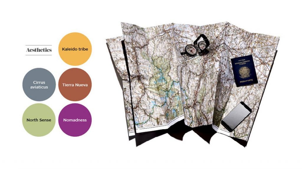
Third story. LONGITUDe, LATITuDE, aLTITUDE
GPS coordinates which collectively constitute a metaphor of a trend focused on “digital nomads”. Longitude, Latitude, Altitude describes a characterising trait of Millennials (whose key role within the sociological system became a topic of discussion in 2014): an incessant desire for freedom and continuous change. A positive restlessness which guides this generation towards the discovery of new places, people and experiences. Judith van Vliet explains: “This trend has shown the first signs in April during the Milan Design Week: take, for example, proposals by Louis Vuitton or Base, Tortona, which have presented products for nomads and travellers, thus bringing attention to this theme. It has been estimated that in 2020 young people will embark on 320 international journeys, a 47% from 2013”. “Modern gypsies” are also affiliated with the digital world and portable technology, enabling them to remain connected to the network and other “nomads”, wherever they are. Such openness means that they are major advocates for co-living and co-working projects, increasingly widespread in Europe and the USA. Co-working camps and workation initiatives (a term combining the words work and vacation) are cropping up everywhere, enabling freelances to work in destinations typically associated with relaxation and holidays. Indeed, freelancers are major professional players within this trend: “37% of Freelancer.com members are 18 to 34 years old, so they are Millennials. By 2020, 40% of Americans will be part of this category, in their role as global citizens, contributing to the blending of cultures”. Following on from this, colors are also a mix and match of tonalities traditionally belonging to nomad culture. Not least fuchsia by Nomadness which pays homage to a love of the Romani population and their energetic colors. Kaleido Tribe’s yellow expresses ties, communication and warmth. It is proposed on a flexible material: rubber, alluding to the trend’s essential requirement of modularity and adaptability. The presence of green is inevitable, a natural continuation of focus on this tonality which was also featured in palettes from previous years: from sage in 2015 to milk-mint in 2016, this year’s cucumber and avocado by North Sense. This name is a focal point, directly taken from the latest experiment in cyborgism by Cyborg Nest: a chip fitted to the body which vibrates when aligned with the Earth’s magnetic field. The grey of Cirrus Aviaticus (identical to contrails) reflects new travelling and urban life styles. 50% of the world’s population lives in urban areas and this figure is set to rise to 75% by 2050. The brick red of Tierra Nueva symbolises new lands waiting to be explored, new experiences to be enjoyed throughout the world.
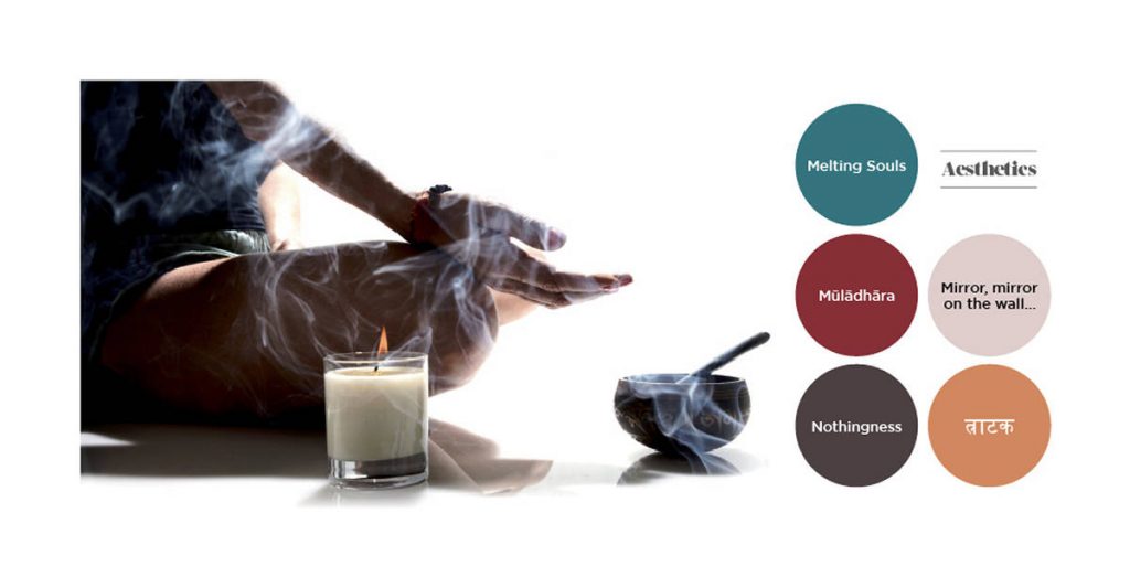
Fourth story. tHROUGH THE MIRROR
More spirituality. A search for answers to the disorder surrounding contemporary society, confused and destabilised by injustice as well as moral and political chaos, has inevitably led to a greater desire for spirituality. In the past people turned to religion and today, young people in particular (approximately 60% of Millennials), are reaching out to an array of esoteric currents to fill a spiritual void. “There is a term used to describe them: SBNR, which stands for Spiritual But Not Religious. This does not mean that religion is over, rather it indicates that different elements are being taken from various religions to create a personal collage of spirituality”. Judith van Vliet continues: “This has generated a phenomenon of ‘open source spirituality’, where it is possible to embrace yoga, pilates, tantra and mindfulness. This attitude is still faced superficially, however there is a great degree of openness towards it. For example, last year the value of the wellness and spirituality markets, which are closely connected, amounted to 390 billion USD, so people are spending much more to feel better”. Back in 2014 the company Pew Research estimated that 37% of Americans fell within the concept of SBNR. The Big Quiet was held a year later, a collective meditation event which took place in Central Park, New York. Those wishing to embark upon an autonomous journey of meditation can turn to Headspace, one of the most downloaded mindfulness apps. It comes as no surprise that there has been a surge in the popularity of ancient rituals, such as crystal healing, the import of eastern philosophical practices, such as “cannabis yoga classes” which are all the rage in cities such as Vancouver, Toronto and San Francisco. This openness is also palpable with reference to death. Designers and architects are contributing towards eliminating western taboos on the topic, with the creation of ad hoc spaces and objects, such as the Death Café, Paris, a place where you can “meet to discuss death over cake and tea”. The trend is expressed in tonalities which exude warm nuances, lightened by neutral tones. The profound tonality of Melting Souls stands out in particular, somewhere between green and blue: a blend of colors which evokes the fusion of different souls and alter egos, into a single personality. Mirror, mirror on the wall… offers a cream white, illuminated from the inside by red pearls which accentuate the light effect of its color, with the intention of symbolically evoking introspective reflection, as recounted by the trend. Mūlādhāra consists of a dark red attenuated by a yellow dot, symbolising the lowest point of the seven chakras, pertaining to body energy. The orange in त्राटक (a Sanskrit word used to denote a form of meditation where you stare into the flame of a candle), alludes to the third chakra, pertaining to the solar plexus. Nothingness symbolises the sense of inner void, with its dark purple nuances, identified as the color of spirituality since the dawn of time.


